
01. Project Overview
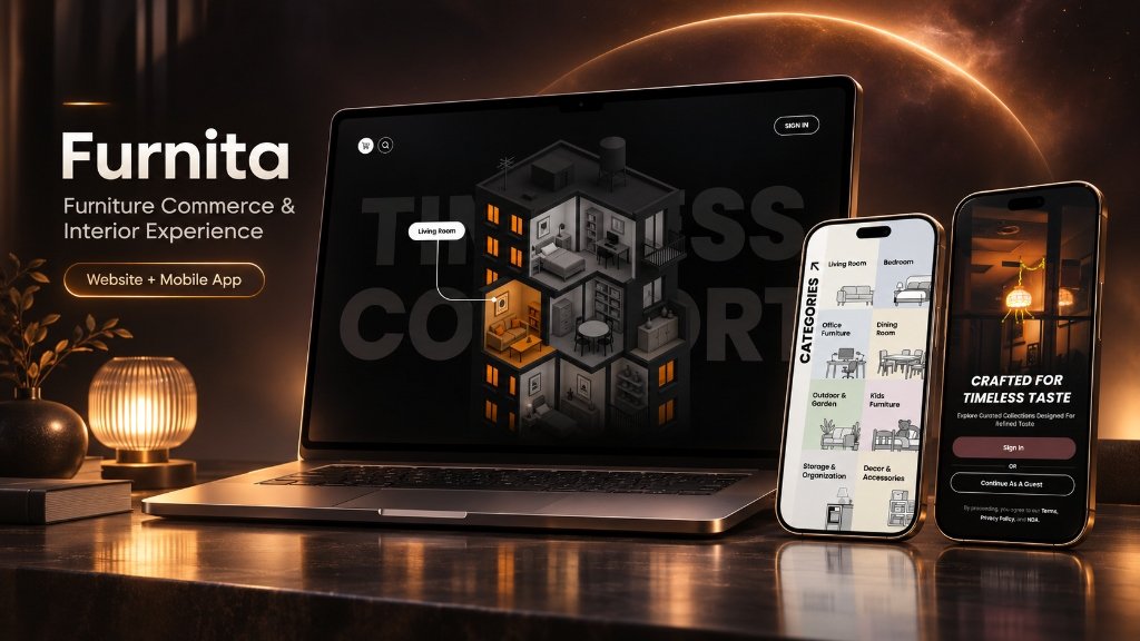
Furnita is a digital furniture and interior-commerce product experience designed to combine atmospheric, room-inspired exploration with structured category navigation and a refined mobile onboarding flow. Conceived as a coordinated product design sample, Furnita explores how modern digital commerce interfaces can elevate the sensory and aesthetic qualities of home furnishing.
Nebula X developed the visual architecture across desktop and mobile formats, uniting an architectural isometric cutaway concept for desktop browsers with an accessible multi-room category directory and an elegant portrait mobile entry point.
02. Product Context
Furniture and home decor shopping is inherently spatial. Unlike standard consumer goods where functional specifications dominate, furniture buying decisions depend heavily on how individual pieces harmonize within an interior environment—considering room layout, ambient lighting, materiality, and emotional warmth.
Traditional e-commerce catalogs often flatten furniture into repetitive white-background thumbnail grids, disconnecting the product from its intended living context. Furnita was structured to address this disconnect by exploring spatial, room-based entry points that let customers browse by architectural living spaces before diving into individual product collections.
03. The Product Challenge
Designing a furniture commerce experience that balances evocative interior storytelling with clear, efficient e-commerce discoverability:
- Spatial vs. Catalog Tension: Finding the equilibrium between immersive architectural exploration (browsing by room) and fast, utilitarian search (browsing by furniture category).
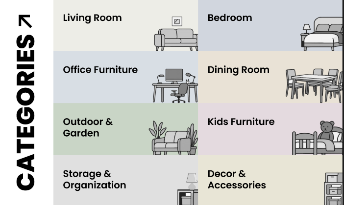
- Multi-Room Furniture Taxonomy: Organizing eight distinct residential and commercial furniture domains (Living Room, Bedroom, Office Furniture, Dining Room, Outdoor & Garden, Kids Furniture, Storage & Organization, Decor & Accessories) into an intuitive, visually identifiable grid.
- Atmospheric Visual Hierarchy: Creating a high-contrast dark aesthetic that highlights warm room lighting and timber textures without sacrificing readability or transactional clarity.
- Multi-Surface Transition: Translating an expansive desktop isometric architectural view into an effortless, thumb-friendly mobile entry flow with clear account authentication choices.
04. Our Product Thinking
The observable interface architecture reflects five core design characteristics:
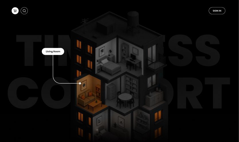
- 01. Room-Inspired Exploration: The website interface utilizes a cutaway architectural building as an interactive anchor, allowing users to visually select living spaces (such as the illuminated living room) directly in context.
- 02. Category-Led Navigation: A clean 2-column directory presents the eight primary furniture collections with gentle pastel backgrounds and minimalist vector line art.
- 03. High-Contrast Materiality: Deep dark backgrounds paired with warm amber lighting draw focus directly to furniture finishes and interior atmospheres.
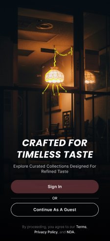
- 04. Refined Mobile Entry: The mobile welcome flow emphasizes brand mood ("CRAFTED FOR TIMELESS TASTE") with dual low-friction pathways: direct "Sign In" or instant "Continue As A Guest".
- 05. Unifying Aesthetic Identity: Consistent typographic restraint and warm interior photography connect the separate desktop and mobile views into one recognizable brand story.
05. UX & Visual Direction
Furnita's design language contrasts dark architectural minimalism with warm residential intimacy:
- Architectural Dark Canvas: Deep charcoal and pure black backgrounds provide a theatrical stage where illuminated interiors and furniture silhouettes command immediate focus.
- Warm Amber Illumination: Strategic amber and gold accents evoke cozy residential pendant lighting, creating an inviting emotional mood for home furnishing.
- Minimal Utility Controls: Clean pill-shaped UI elements (circular shopping cart, search trigger, and border-radius action buttons) keep the focus squarely on the interior environment.
- Soft Pastel Taxonomy: For category browsing, soft muted pastels (sage green, dusty blue, warm sand, blush rose) provide distinct visual identities for each room without visual clutter.
06. Website Experience (Architectural Exploration)
The primary desktop website concept introduces an innovative spatial browsing model:
As captured in IMAGE 2, the landing experience centers on an isometric architectural cutaway building set against a pitch-black background with subtle watermark typography reading "TIMELESS COMFORT". A callout pointer highlights the illuminated "Living Room" with sofa, coffee table, and warm lighting, while other rooms remain subtly silhouetted. Minimalist utility controls—a shopping cart badge, search icon, and top-right "SIGN IN" pill—preserve an uncluttered editorial viewing experience.
07. Category Discovery (Multi-Room Taxonomy)
Complementing the architectural spatial view is the structured category discovery interface:
As documented in IMAGE 3, the "CATEGORIES ↗" interface organizes Furnita's full product catalog into eight clear room departments across a 2-column layout:
- Living Room: Modern sofas, accent chairs, and coffee tables.
- Bedroom: Bedframes, nightstands, and ambient lighting.
- Office Furniture: Ergonomic desks, task chairs, and workspace storage.
- Dining Room: Dining tables, dining chairs, and credenzas.
- Outdoor & Garden: Patio seating, weather-resistant loungers, and planters.
- Kids Furniture: Children's beds, nursery storage, and play furniture.
- Storage & Organization: Wardrobes, dressers, and shelving units.
- Decor & Accessories: Wall art, tabletop objects, and decorative lighting.
08. Mobile Experience (Onboarding & Guest Flow)
The mobile interface translates Furnita's interior warmth into a focused smartphone onboarding experience:
As shown in IMAGE 4, the mobile welcome screen features atmospheric low-light photography of an illuminated pendant lamp in a refined interior. The headline "CRAFTED FOR TIMELESS TASTE" and subline "Explore Curated Collections Designed For Refined Taste" set an aspirational tone. Two primary action pathways accommodate different customer intents: a filled "Sign In" button for returning members, and an outlined "Continue As A Guest" button providing friction-free access for immediate browsing.
09. Authentic Interface Gallery (Strict Source Discipline)
Featuring exclusively the three founder-approved authentic interface screenshots in strict required sequence. Zero generic mockups, unverified 3D renders, or unrelated marketing images.
10. Verified Project Scope & Status
To maintain strict engineering truthfulness across the Nebula X portfolio, Furnita's development status is clearly classified:
- Classification: Product Sample / UI/UX Product Experience
- Website Scope: Architectural room exploration concept and multi-category layout system.
- Mobile Scope: Mobile application design suite featuring onboarding, guest entry, and category browsing (evaluated as interface design work; not claimed as an app store deployment).
- Independent Relationship: Distinct from the separate Furnita Woodcraft Marketplace design system.
- Commercial Claims: Zero unevidenced sales metrics, production payment gateways, or client testimonials.
11. Related Work & Contact CTA
Interested in creating an evocative interior-commerce experience, spatial web catalog, or coordinated mobile product suite? Nebula X engineers design systems and software solutions built for real business.